
App Solutions had built a technically solid product, but user adoption was lagging. The interface felt disjointed, onboarding was confusing, and key actions buried in navigation caused users to abandon the app before reaching its core value. The team knew the product worked — they needed users to feel that too.
Our mandate was to redesign the UX and UI end-to-end: from the first screen a user sees to the moments that build long-term engagement.
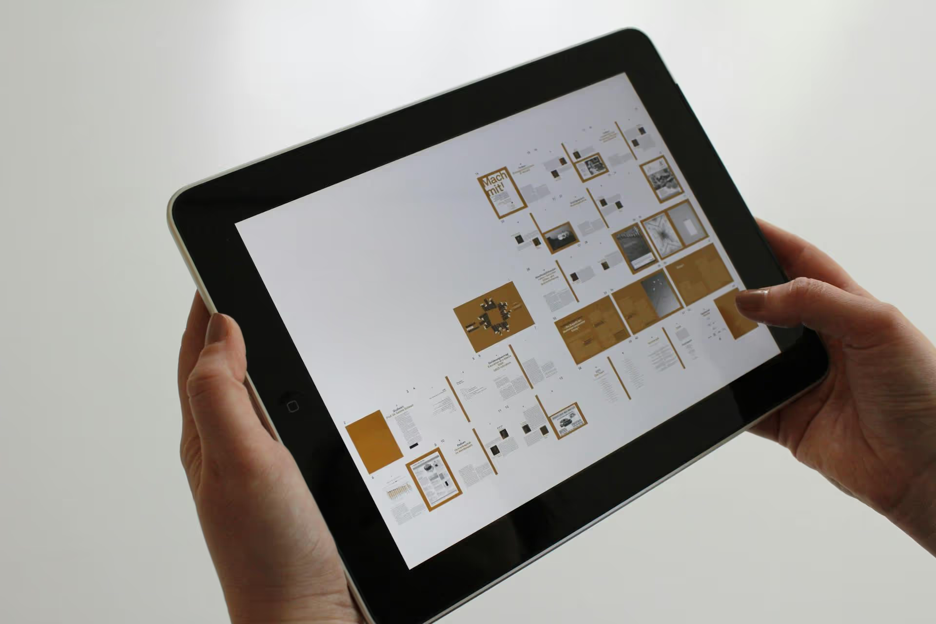
We started by mapping the existing user journeys and identifying the points of highest drop-off. Through user flow analysis and structural review, we built a clear picture of where the product was losing people — and why.
From there, we redesigned the core flows: onboarding, navigation, key feature access, and feedback states. The new UI system was built around clarity and consistency — ensuring that every screen communicated its purpose immediately, without relying on the user to figure things out.
"The redesign didn't just make the app look better — it made it feel obvious. Users now get to the value faster, and we can see it directly in our retention numbers."
App Solutions defined four essential outcomes for this project:

Redesigning an active product without breaking what existing users already knew required careful navigation. Our main challenges were:
App Solutions now has a product that delivers on its promise — from the first tap. The new UX and UI give users an immediate sense of confidence and make the core functionality accessible without friction.
Good UX is invisible. Users don't notice it — they just find themselves achieving what they came to do. That's the outcome we designed for, and that's what was delivered.